How to Optimize Images for Your Website on Mac
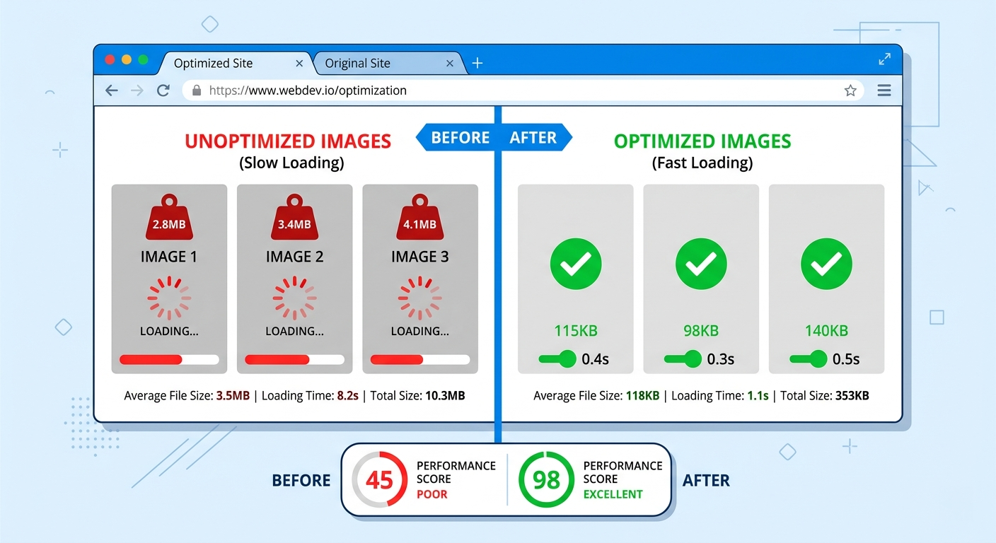
Here's a stat: images account for roughly 50% of a typical webpage's total weight (per HTTP Archive data). If your site is slow, your images are almost certainly the single biggest reason.
The good news: image optimization is the easiest performance win available. You don't need to refactor code, change your hosting plan, or learn a new framework. You just need to make your images smaller and smarter.
The Three Pillars of Image Optimization
Every image optimization decision boils down to three choices:
- Format: WebP > JPG for photos. WebP > PNG for graphics with transparency. SVG for icons and logos. AVIF if you want the bleeding edge.
- Dimensions: Never serve a 4000px-wide image in an 800px container. Resize to 2x the display size (for Retina screens) and stop there.
- Compression: 75-85% quality for photos is the sweet spot. Below 70%, artifacts appear. Above 90%, you're wasting bytes for quality nobody can see.
Doing all three correctly can reduce your image payload by 90% or more.
Step 1: Audit Your Current Images
Before optimizing, find the worst offenders:
- Browser DevTools: Open the Network tab → filter by "Img" → sort by Size. The biggest files are your top priority.
- PageSpeed Insights / Lighthouse: Run your URL and look for "Properly size images" and "Serve images in next-gen formats." These reports flag exactly which images need attention.
Common findings: a hero image that's 3MB, product thumbnails at 500KB each, PNG screenshots that should be JPGs. These are easy wins.
Step 2: Choose the Right Format
A simple decision tree:
- Photo or complex image → WebP (lossy). If it came from a camera, this is the answer.
- Graphic with transparency → WebP (lossless) or PNG. Keep the alpha channel.
- Icon or logo → SVG. Infinitely scalable, tiny file size.
- Maximum compression → AVIF. 20% smaller than WebP, ~93% browser support.
Rule of thumb: camera photos → WebP lossy. Design tool exports → WebP lossless or SVG.
Step 3: Resize and Compress
This is where the real savings happen.
Real Site Optimization
Here's the ShrinkPad workflow for a full site optimization:
- Drop your images folder: Grab your entire
images/orpublic/directory and drop it onto ShrinkPad. - Choose WebP output: One click to set the target format.
- Set quality to 80%: The default sweet spot for web. Adjust up or down based on the preview.
- Enable subfolder processing: Your
images/products/,images/blog/,images/team/structure stays intact. - Compress: ShrinkPad processes everything in parallel. A full blog's worth of images takes seconds, not minutes.
For e-commerce specifically: product images, category banners, lifestyle photography — all can be batch-processed in a single pass. Upload the optimized versions and your site speed jumps immediately.
Stop uploading your files to the cloud.
Compress images and videos locally on your Mac. Fast, private, and no internet required.
Bonus: Responsive Images with srcset
For extra credit, serve different sizes to different screen widths:
<img
  srcset="photo-400.webp 400w,
          photo-800.webp 800w,
          photo-1200.webp 1200w"
  sizes="(max-width: 600px) 400px, 800px"
  src="photo-800.webp"
  alt="Description"
>
This ensures mobile users download a 400px image instead of the full 1200px version. Combined with WebP format and proper compression, you're looking at a 95%+ reduction in image payload for mobile visitors.
Your Users (and Google) Will Thank You
Image optimization isn't glamorous work. But it's the single highest-leverage thing you can do for website speed, and speed directly impacts your search rankings, bounce rate, and conversion rate.
Want to convert everything to WebP specifically? See our detailed guide: How to Convert Images to WebP on Mac. For general-purpose compression of your photo library, see How to Batch Compress Images on Mac.